ERP & CRM Platform for Manufacturing

Lead UX Designer

Client names anonymised

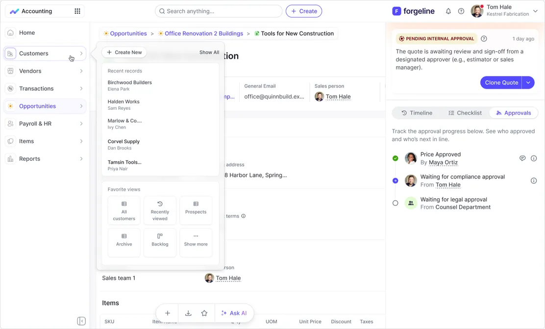
The platform competes with Salesforce and NetSuite, but every new module made its navigation harder to use. I led the redesign that turned a crowded tab bar into a scalable vertical navigation, standardised the setup wizards, built the design system to carry it forward, and handed over a ready-to-run validation plan.

  • Navigation Redesign
  • Wizard Flows
  • Design System
  • Service Blueprint
  • UX Audit
  • Usability Test Plan

The Challenge

The platform is an enterprise ERP & CRM system built to compete with Salesforce and NetSuite. Its feature set was strong, but the interface had not kept up: every new module was squeezed into a horizontal tab bar, setup flows behaved differently from screen to screen, and users lost track of where they were.

For a product selling on breadth, the navigation had become the bottleneck — the more the platform grew, the harder it became to use.
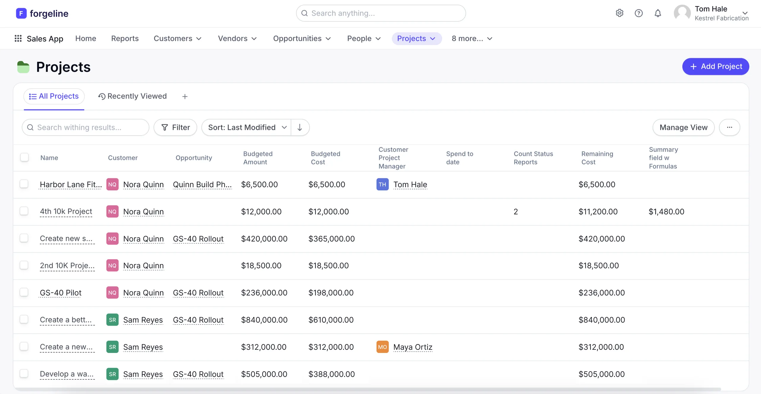
The platform before the redesign: a crowded horizontal tab bar above a dense Projects table

My Approach

As lead designer I owned the work end to end — from diagnosing the problems to shaping the solution and planning how to prove it.

  1. Audit

    Heuristic review of the core CRM flows to find what blocks everyday work.

  2. Prioritise

    Grouped 15 findings into a few structural problems, ranked by business impact.

  3. Redesign

    Three rounds of navigation design, standardised wizards and a design system.

  4. Validate

    A ready-to-run usability test plan to measure the redesign with real users.

What the Audit Uncovered

A heuristic evaluation of the core CRM flows surfaced 15 issues across usability, navigation, interface and process. Rather than fixing them one by one, I grouped them into the few structural problems holding the product back — and let those set the redesign priorities.

  • 15issues found
  • 4categories
  • 2severe — both in navigation
What we foundWhat changed
Horizontal tabs bury new modules under dropdownsA scalable vertical navigation with previews, recents and favourites
Unclear app context in the launcherA persistent app switcher with a clear active state
Long setup flows and obstructive edit modalsOne wizard pattern with progress, autosave and consistent actions
Inconsistent typography, spacing and componentsA design system with tokens for colour, type and spacing

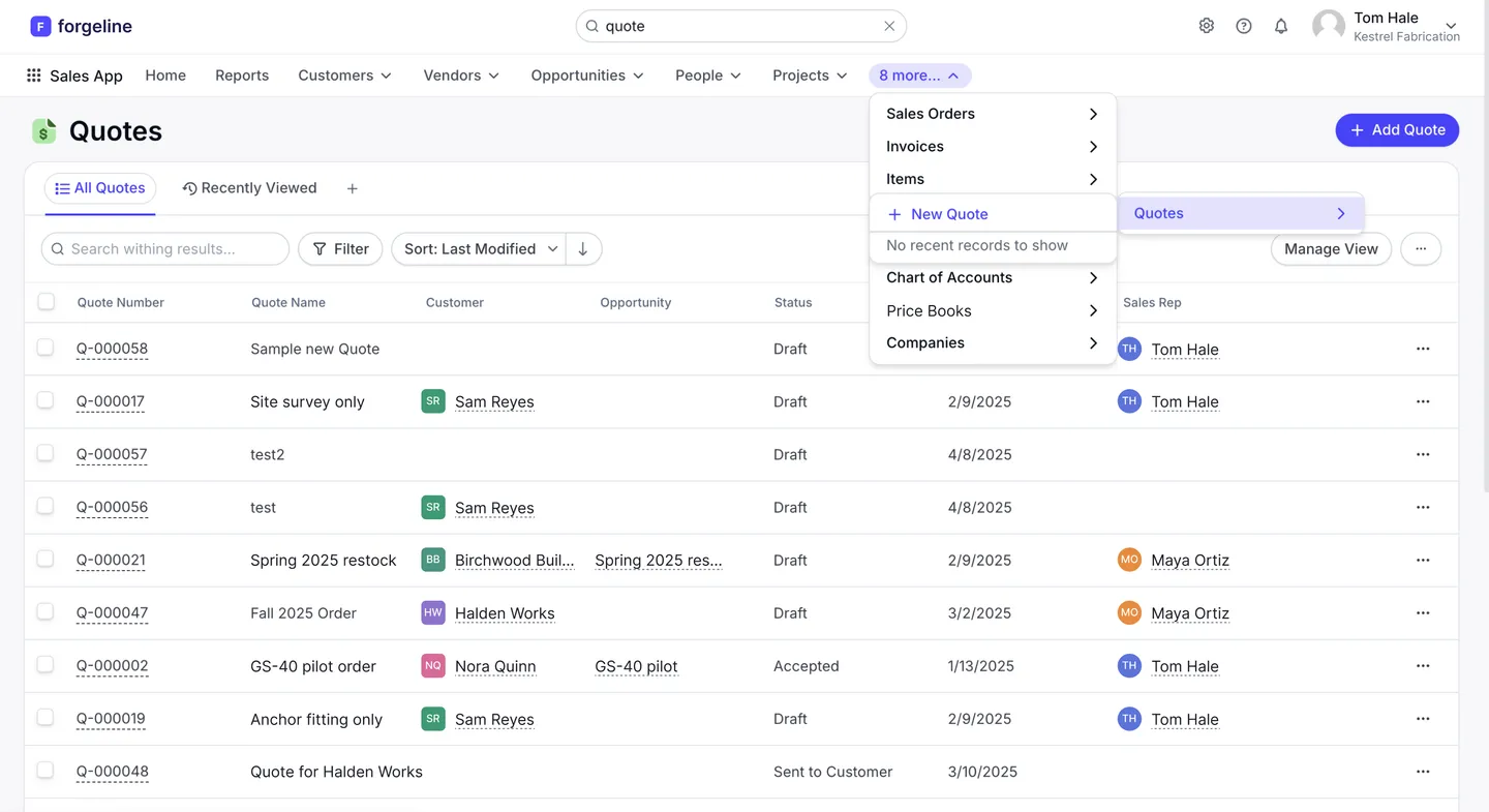
Horizontal tabs capped how many modules could be visible at once, so every new feature pushed something else into a dropdown. I moved navigation into a collapsible vertical sidebar: it scales to any number of modules, keeps the current app always visible, and matches how people naturally scan a screen — top to bottom, left side first.

Before: modules hidden in overflowing tabs
The old Quotes list: the "8 more…" tab overflows into a nested dropdown that covers the table below
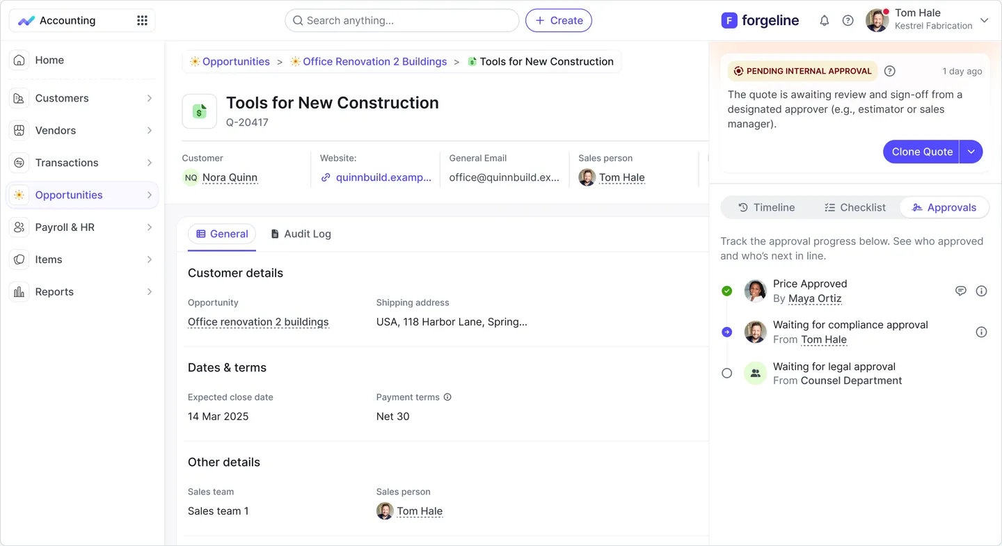
After: a scalable vertical sidebar
The redesigned collapsible vertical sidebar next to a quote record

Three rounds, one direction

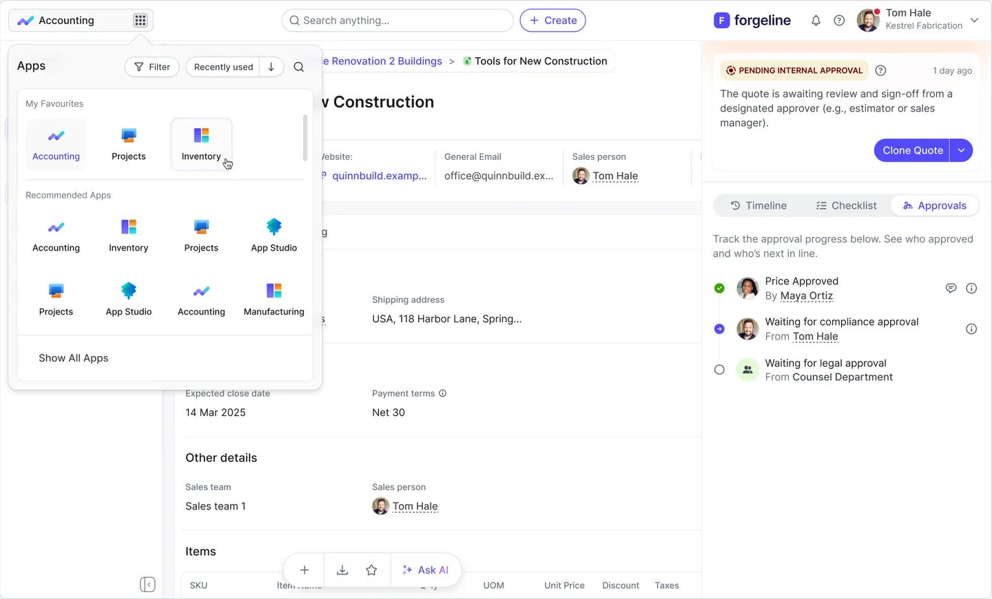
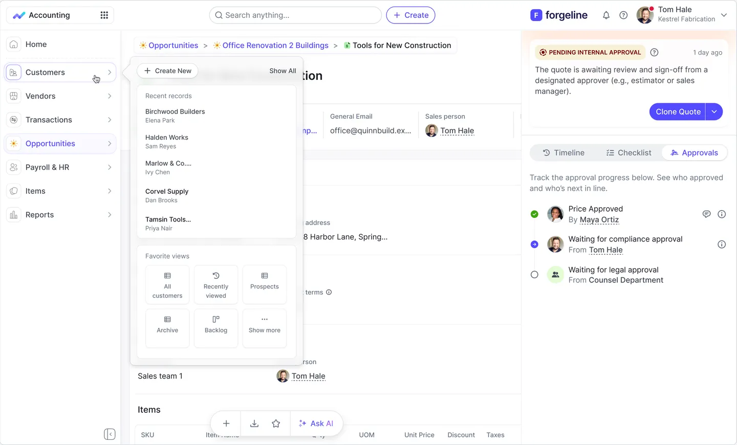
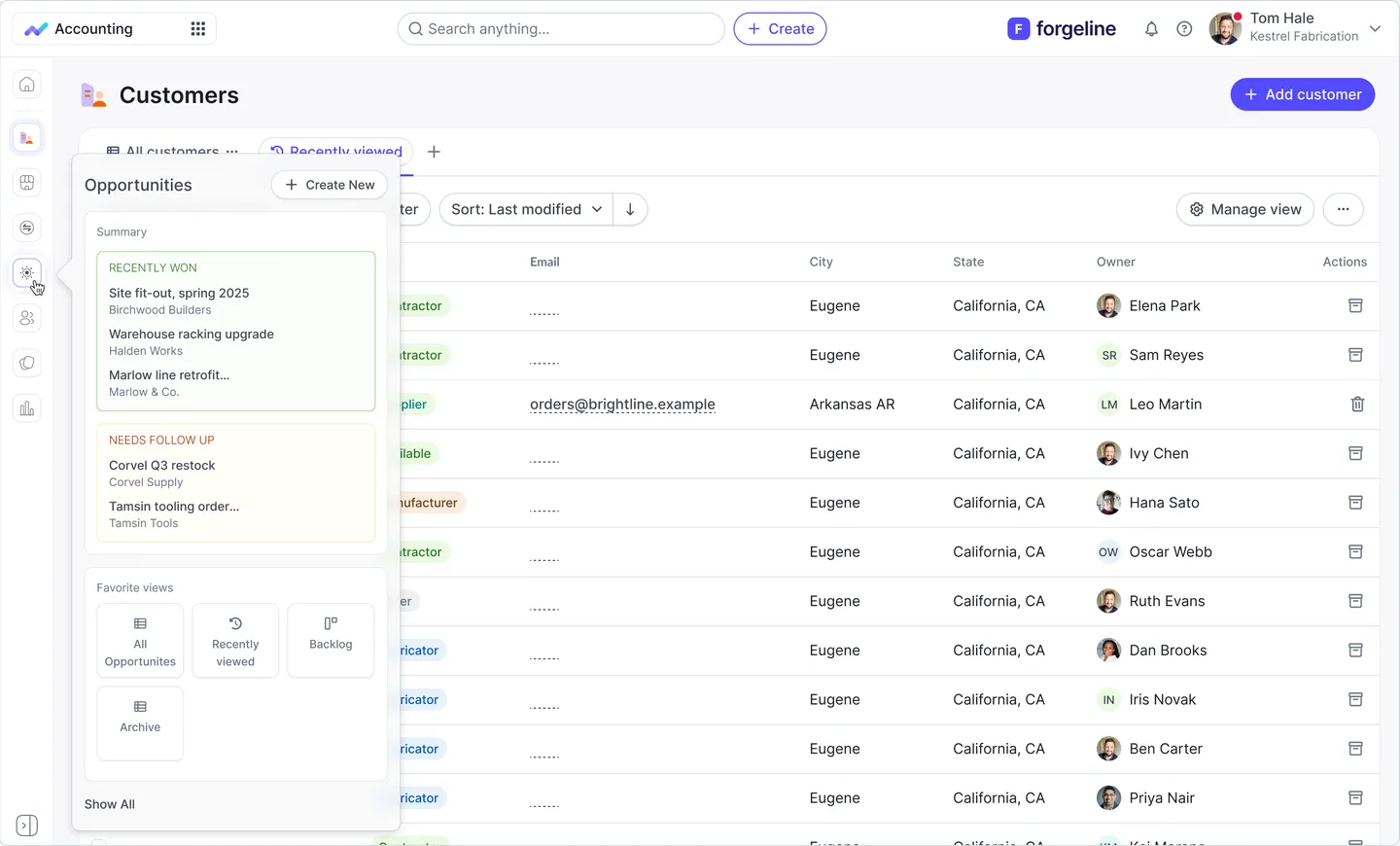
Each round tested a different answer to the same question: how do people get back to the work they care about fastest? The later rounds added context directly into the menu — recent records, saved views and deal summaries appear on hover, so users can jump straight to what they need without opening a module first.

Round 1 · App switcher — favourites and recently used apps in one place
App switcher panel with favourite and recommended apps
Round 2 · Recents & saved views — one click to the right list
Hovering a sidebar module shows recent records and favourite views
Round 2 · Collapsed-rail previews — won deals and follow-ups at a glance
Collapsed sidebar preview summarising recently won deals and deals needing follow-up

A final round explored menu background tints (neutral and purple scales) to balance contrast against dense tables — decided directly in the design system tokens.

One Wizard Pattern for Every Long Flow

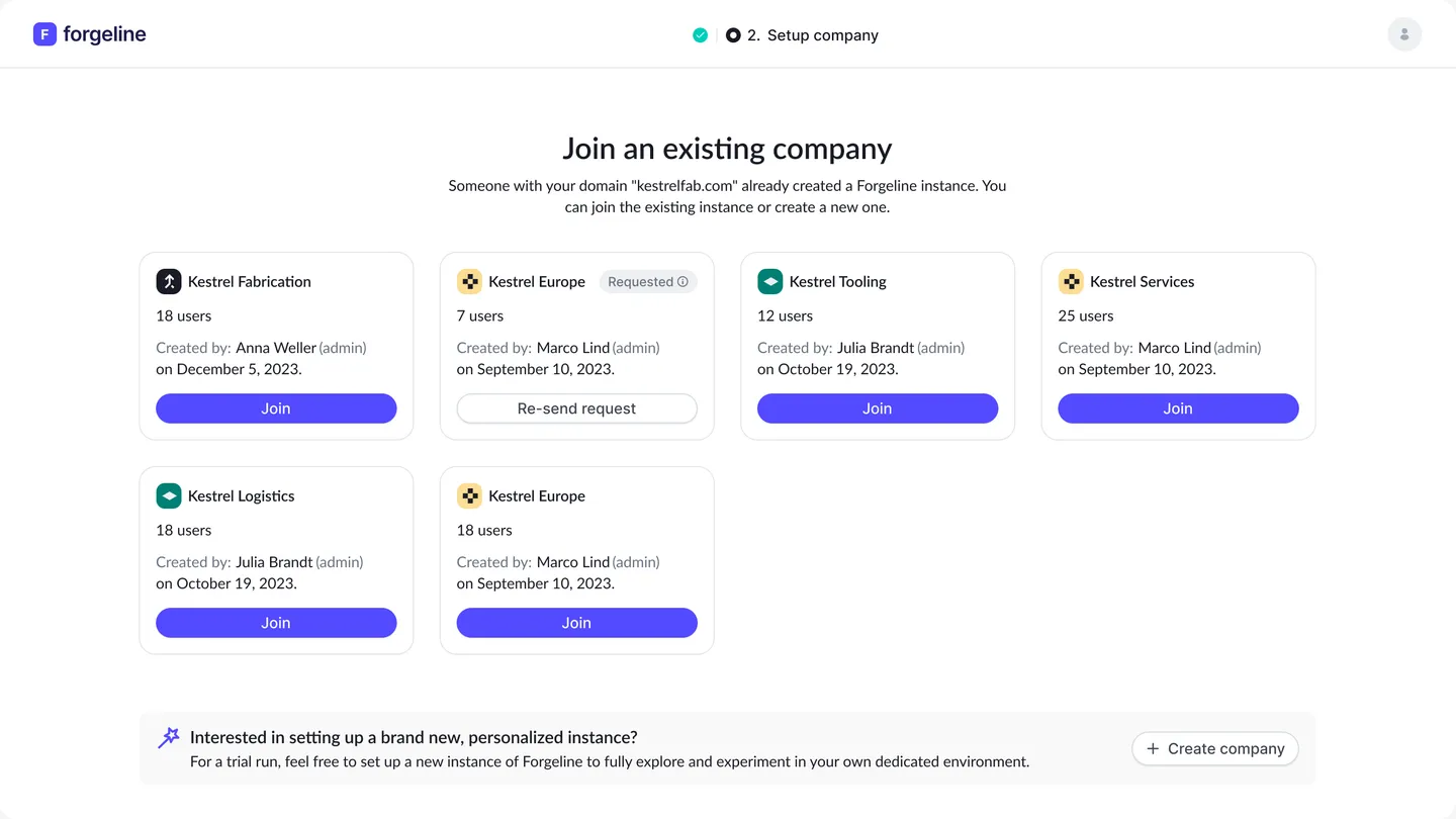
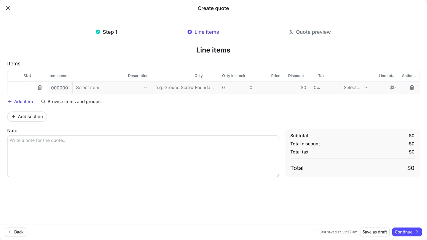
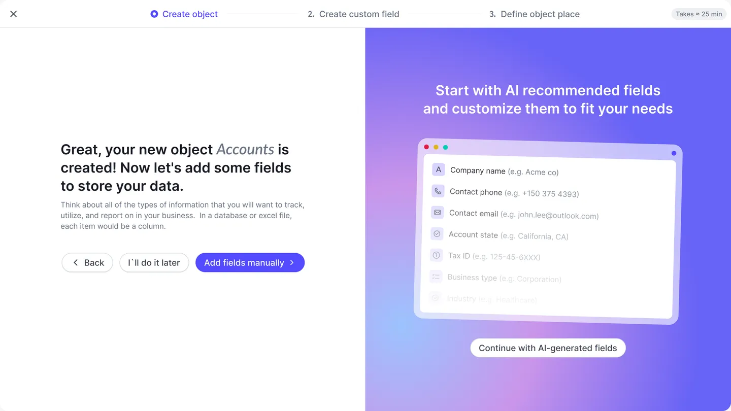
Setting up a company, building a quote and creating a new object used to behave in three different ways. I designed one wizard pattern — a progress stepper, a clear header for the current step and consistent Back / Continue actions with autosave — and applied it across 5+ journeys. In object creation, AI suggests the fields a team is likely to need, so setup starts from a sensible default instead of a blank form.

1. Join or create a company
Onboarding step: join an existing company instance or create a new one
2. Build a quote
Quote wizard: adding line items, with totals and autosave
3. AI-recommended fields
Object creation wizard offering AI-recommended fields

Service Blueprint for the Opportunity Lifecycle

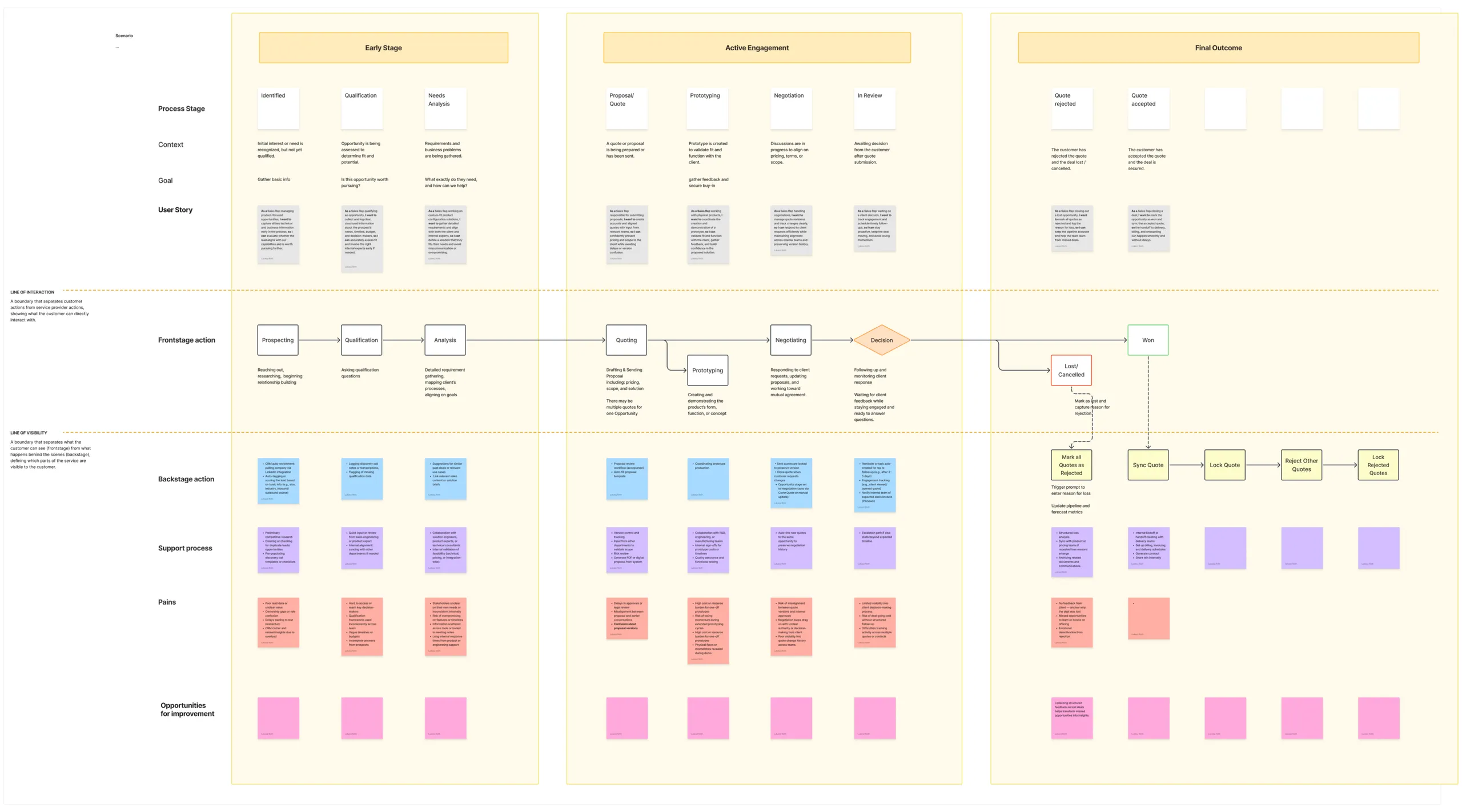
To make sure the new flows matched how deals are actually won, I mapped the full opportunity lifecycle — from prospecting to won or lost — across user actions, frontstage and backstage processes, pain points and opportunities. A proto-persona and a detailed scenario kept the team focused on the sales rep doing the work.

The full service blueprint map, from prospecting to won or lost
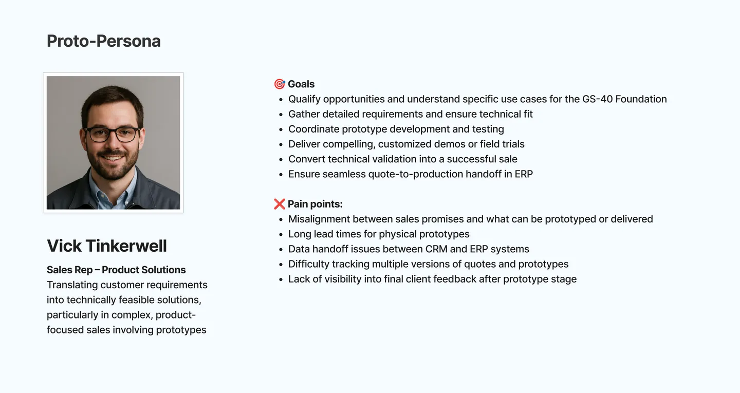
Proto-persona: Vick Tinkerwell, Sales Rep
Proto-persona of a sales rep, with goals and pain points
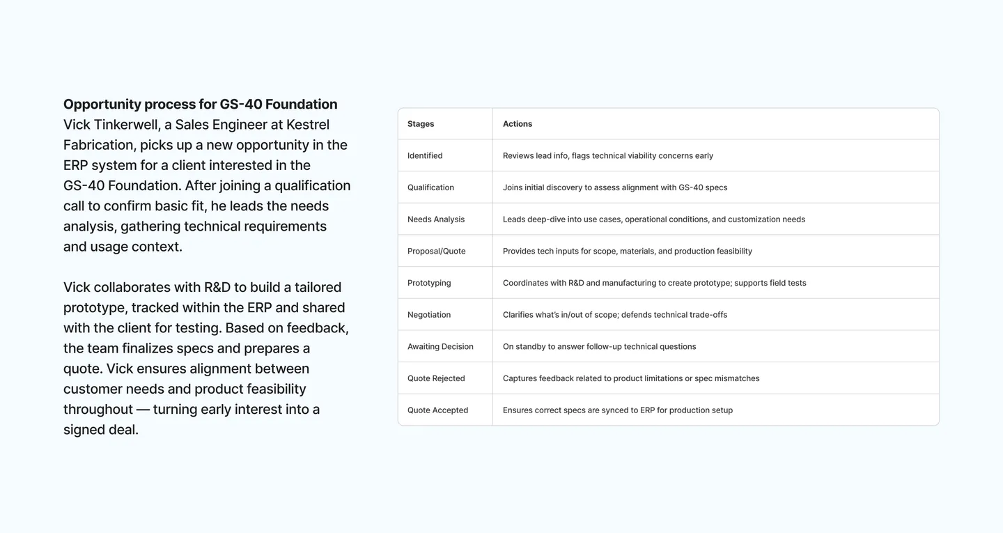
Scenario & user stories
Scenario table mapping stages, actions and user stories for a sales opportunity

A Design System to Carry It Forward

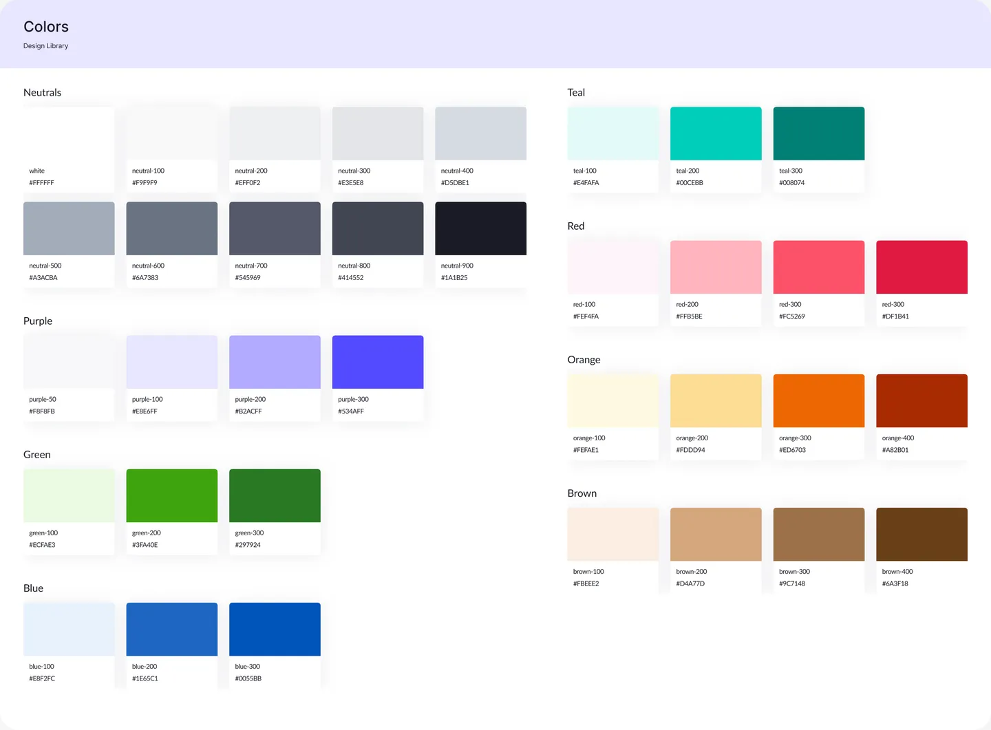
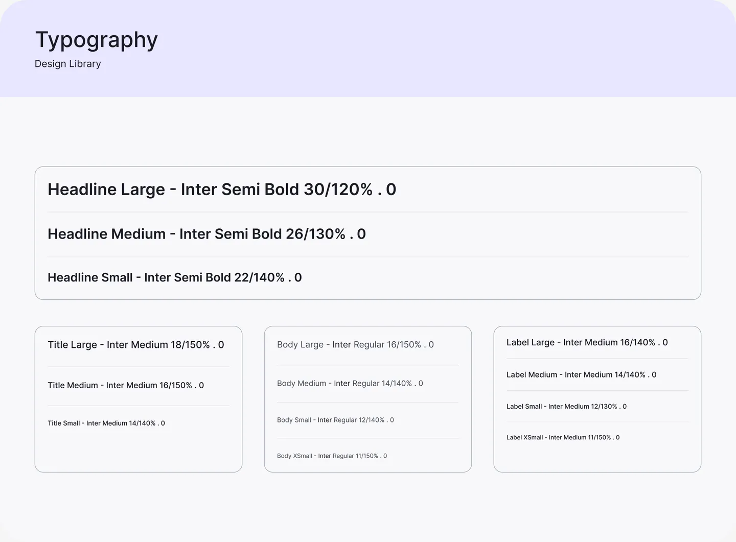
To keep the redesign consistent as the product grows, I built the design system from scratch: a structured colour palette (Neutrals, Purple, Green, Blue, Teal, Red, Orange, Brown) mapped to semantic tokens, a clear Inter type scale from Headline Large 30px to Label XSmall 11px, and a component library covering tables, charts, page templates, illustrations and icons.

Colour tokens & semantic mapping
The full colour token system: Neutrals, Purple, Green, Blue, Teal, Red, Orange and Brown scales with hex values
Typography system & hierarchy
Typography scale from headline to label sizes, built on Inter

Planned · ready to run

Validating the Redesign

A redesign is a hypothesis until real users confirm it. The engagement ended before sessions could run, so I handed the team a complete, ready-to-run usability test plan — so the next step would be measuring the new navigation, not debating it.

Goals

  • Measure how efficiently people find their way through the new menu
  • See how each design fits real, day-to-day workflows
  • Collect qualitative feedback on clarity and ease of use

Participants

10 people who use ERP and CRM systems every day — the platform’s real target audience.

Method

  • In-depth interviews about workflows and navigation pain points
  • Task-based sessions: find a specific setting, create a new view, move between modules
  • A/B comparison of the two navigation directions: app switcher (round 1) vs. recents & previews (round 2)

How success is measured

MetricWhat it tells us
Task completion rateCan people find what they need at all?
Time on taskHow much faster is the new navigation?
Number of errorsWhere do people take wrong turns?
Task satisfactionHow does it feel to use, task by task?

Project Impact & Deliverables

The redesign gave the platform a navigation model that scales with every new module, one consistent pattern for its longest flows, and a design system to keep future work aligned — plus a clear plan to prove it with real users.

  • 4

    structural problems prioritised

  • 3

    navigation design rounds

  • 5+

    wizard journeys standardised

  • 1

    test plan, ready to run